
There has been some interesting discussion recently as to whether observability practice is over-reliant on dashboards - to the exclusion of providing genuine practical value to users. This touches on a really interesting point about the design and functionality of observability systems. On the one hand, it is hard to envisage any observability system not making use of dashboards. On the other hand, it is probably correct to point out that the spirit of observability is one which is proactive and on the front foot, whereas the classic dashboard represents a more static and reactive posture.
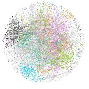
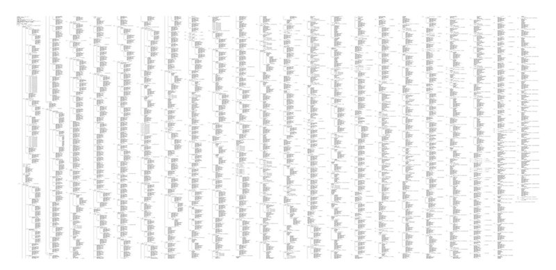
Whilst dashboarditis is a danger, the creative use of visualisations itself is not really a problem. This is because observability is, in a sense, a visual discipline. To an extent, it has to be. Observability is extremely data-heavy, and we need visual tools for summarising patterns in the billions and billions of data points that our systems collect. The image below, for example represents the flows across the 1,600 microservices used by Monzo bank.
Creating UI's to handle this volume of data and this level of complexity is a daunting task. In fact, the need to create visualisations and metaphors which capture huge streams of telemetry and translate them into an easy intelligible form is inherent within the nature of observability. The gauges, meters and charts we use have their origins in industrial roots of the practice of observability.
Observability is sometimes described as, fundamentally, a data engineering discipline. In his 2009 book Information Is Beautiful, David McCandless explored how designers across many fields have captured the underlying patterns in that raw data and translated them into information in the form of compelling visualisations.
Creating these visualisations is, itself, a craft requiring enormous skill and an understanding of design, composition, colour and the principles of creating an engaging User Experience. In this article we peel off from some of the usual themes of observability commentary and turn the spotlight on to the work of some of the designers in the field, whose skill and creativity is as critical for the success of an observability systems as those who write the code.
One of the great fallacies about design is that it is just a skin or a surface applied to the machinery created by developers. In fact, design is a discipline that considers the system in a much broader sense and good UX design is inseparable from good system design.
Every designer in the observability field understands that the tooling must be able to go beyond merely painting pictures of anomalies and outages. It must also be a tool to assist engineers in identifying root causes and taking remedial action. This then, is the two-fold challenge of the UI/UX designer of an observability system. Firstly, enormously vast amounts of data must be assembled into easily understandable patterns. Secondly, UX engineers must construct pathways through this data that leads from visualisation to action and productivity.
Naturally, as the dark mode vs light mode debate shows, opinions on 'good' UI are largely subjective and depend on individual user tastes and preferences. What follows therefore is, inevitably, a personal take on design and User Experience in a particular set of tools. There is an incredible amount of sophisticated design in observability tooling and we can really only cover a small example in this article.
It might be appropriate to start our tour of Observability design with Grafana - as visualisation is embedded not only in the company name but also in their DNA. Grafana dashboards are a ubiquitous sight in observability, and they are renowned for their breadth as well as their power and ease of use. Their dashboards have been used for everything from managing space missions to analysing milk production on a small Swiss farm. The creativity and ingenuity of the Grafana community is celebrated in the annual Grot awards, which recognise excellence across a number of categories.
The popularity of Grafana has not come about by accident. As this article by Nilson Gaspar illustrates, the familiar grace and simplicity of the Grafana UI is the product of a rigorous and painstaking design process. The article describes the process behind the design for the Grafana Frontend Observability product. It is a fascinating insight into the role of the designer and how it involves continuous interaction with engineers, as well as an awareness of business outcomes. Nilson discusses how he drew inspiration not just from common observability motifs but also from sources such as video games and programming IDEs. He also had to familiarise himself with the underlying technologies and delve into both OpenTelemetry as well as the Grafana Faro Web SDK.
One of the most widely admired visual exploration tools in the whole of the observability market is probably the Honeycomb BubbleUp feature. This is a unique and incredibly powerful and intuitive tool for digging into your data to find correlations and resolve anomalies. One of the most striking aspects of the tooling is the incredible simplicity of the UX. To activate the feature a user just draws an arbitrary box around the data points on a heatmap. The BubbleUp feature then generates a series of histograms comparing the selected dataset with the baseline - i.e. all of the remaining events.
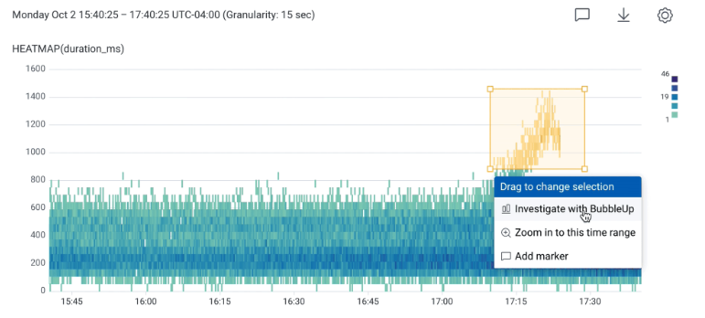
Like all of the best visual tooling, the purpose of BubbleUp is not simply to provide some cool UI. It serves a serious purpose in helping users discover anomalies amidst the enormous volumes of high cardinality data ingested by modern observability systems. It is also a tool which democratises the investigative process - you do not have to be a PromQL guru to delve into your data and find patterns and relationships.
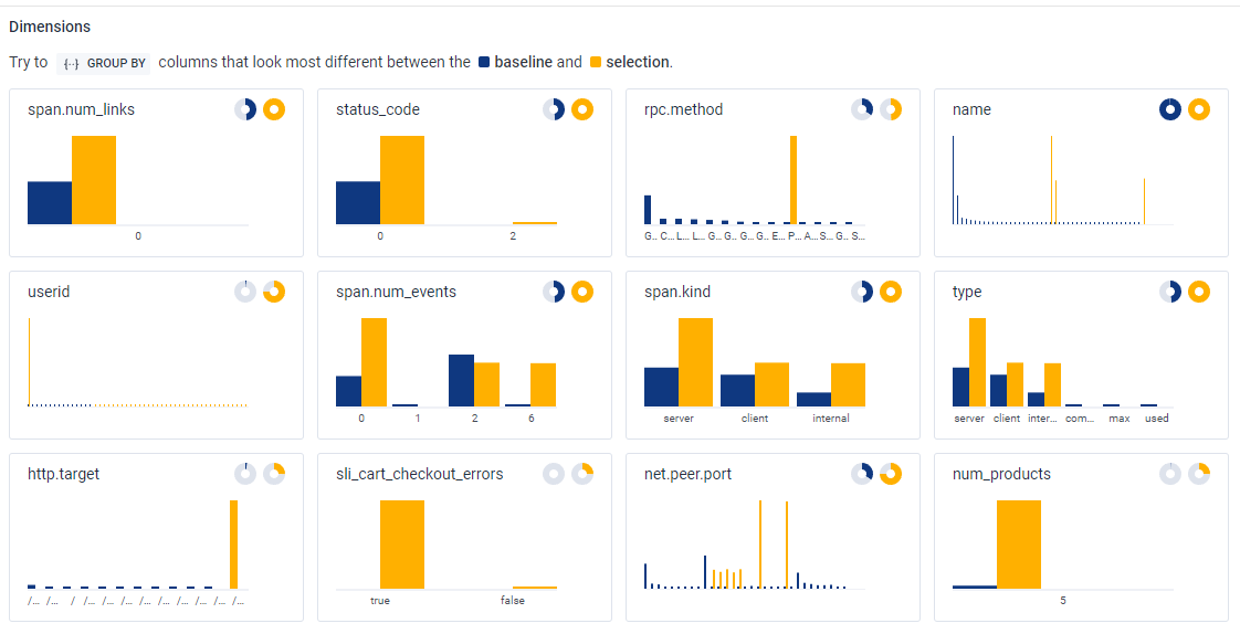
The BubbleUp design was created by Danyel Fisher - a UX and data visualisation specialist. As Martin Thwaites, Principal Developer Advocate at Honeycomb told us, part of Danyel's brief was to design a feature which would not just deliver a wow factor, but also to tap into the rich dimensionality of the Honeycomb datastore. As with most great UX implementations, the feature did not just pop into Danyel's head fully formed. It was the result of "working closely with our target users to understand their needs, iterating on the design, and then tracking the use of the tool over time."
This approach involved gaining a deep understanding of how users went about investigating anomalies. They defined the typical debugging approach as the "core analysis loop", whereby a user would select a base metric for an anomaly and then iteratively compare it with other metrics in the hope of discovering some kind of causal relationship. Given that Honeycomb is a high dimensionality system, this could end up being a lengthy and repetitive process.
The purpose of Bubble Up is to shorten that loop. However, given that Honeycomb can capture so many dimensions, the next task was to identify which were the best candidates for comparison. This involved further research and beta testing with customers. This led to a number of refinements including changing the colour palette from blue/green to blue/yellow, evaluation of ranking algorithms and the introduction of donut charts to represent the number of non-empty values in a dataset. Overall, the juxtaposition of the selected dataset with the array of baseline histograms serves as an illustration of James Tufte's principle that "Reality is multivariate".
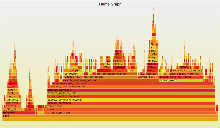
As we have mentioned, many of the visual metaphors of observability are inherited from the discipline's industrial origins. However, observability engineers have also had to create new kinds of visualisations to meet the challenges of representing the special behaviours of modern, distributed computer systems. Possibly the best known of these is the Flame Graph, which was devised by Brendan Gregg whilst working on a MySQL issue where he "needed to understand CPU usage quickly and in depth". The primary diagnostic tool for this kind of issue is a CPU profiler, which takes samples of stack traces. Unfortunately, for a large sample this produces virtually unreadable "walls of text".
To make the problem manageable, Gregg created a prototype of a visualization that leveraged the hierarchical nature of stack traces to combine 'common paths'. Since the visualization explained why the CPUs were "hot" (busy), he chose a warm palette. With the warm colours and flame-like shapes, these visualizations became known as flame graphs. The Y-axis of the graph shows the stack, with the root call at the bottom. The X-axis does not represent time. Instead, it represents the prevalence of function calls within a particular level. The width of each horizontal function box represents its frequency - not its processing time.
The final form of the Flame Graph was not arrived at without a substantial amount of trial and error. As Gregg points out in his article, he originally tried using visualisations created by Neelakanth Nadgir and Roch Bourbonnais - which used the X-axis to represent the passage of time. Brendan removed the time element and "reordered samples to maximize frame merging", to create the result we see below.
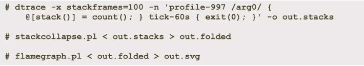
Brendan has published quite a bit of documentation around flame graphs and their evolution and uses. In this presentation on SlideShare, he even shares how you can roll your own flame graphs using the Linux dtrace tool and his own Flamegraph library
The market is awash with network monitoring products, and it takes a lot to stand out from the crowd. One product which certainly does make an impression is IBM's SevOne. The quality of SevOne's design is not just a nice-to-have. It is actually a functional necessity. As Product Manager Brendan Schimmel put it, SevOne is designed to monitor the largest and most complex networks on the planet. This means ingesting huge amounts of telemetry. As Brendan notes though, anybody can fill up a hard drive. The real challenge is building systems to enable users to easy assimilate that data and act upon it.
Interestingly, Brendan is a Network Engineer by background. As the design lead for SevOne though, he also displays both a deep understanding of UX as well as an obsessive attention to detail. At the heart of his design thinking is the “Don’t Make Me Think” philosophy. This translates into a UI where the goal is to make the User Experience as frictionless and productive as possible.
Tools such as SevOne are not merely intended to visualise the state of a network or a cluster or a device. They must also create pathways that users can navigate through as effortlessly as possible. Structuring those flows and funnelling the user to the exact view they need is an art as well as a science and is the result of continuous iteration and re-working. One of the aspects of SevOne that we were most impressed by is its ability to summarise and aggregate whilst also retaining the full context of the underlying data. This means the system has extremely powerful capabilities both for drilling down as well as for finding rich correlations at each level of analysis. It also has a tremendous array of ease-of-use features such as Chains, report versioning and even Git style-stashing, where you can temporarily save a piece of work and come back to it later.
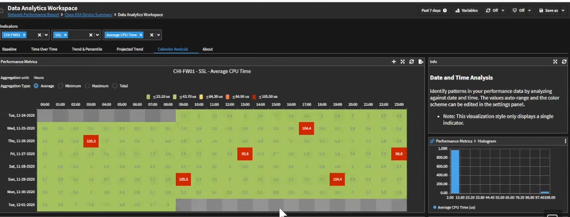
As we noted recently in our newsletter feature on SevOne, the aesthetics of the product are uniformly gorgeous, so we will just alight on a couple of examples where there is a compelling fusion of creative form with technical function. Classically, patterns for metrics such as CPU usage are expressed as line graphs. This can be a useful visual aid for spotting peaks and troughs and anomalies. The graphic below however is a great example of repackaging that data in a form that immediately highlights hotspots using a calendar format so that temporal patterns are really brought to the forefront.
The Sankey Diagram is a common method of visualising flows of network traffic. Interestingly, its history goes all the way back to the 19th century, when it was devised by the Irish naval captain Matthew Henry Phineas Riall Sankey as a means of depicting the energy efficiency of a steam engine. The image below is a reproduction of the first Sankey diagram from 1898:

The image below is a detail of a Sankey Diagram in SevOne - and as you can see, the state of the art has moved on somewhat. The modern incarnation is virtually unrecognisable from its predecessor.
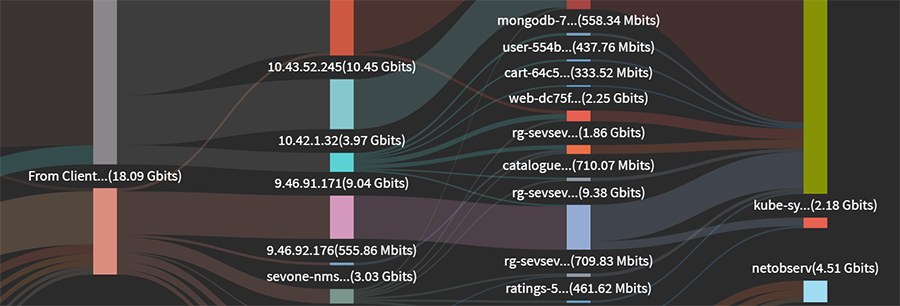
Sankey Diagrams are used widely in network monitoring tools, but the designers at SevOne have displayed an attention to detail which really elevates the user experience. The font on the labels of the stage markers is really sharp. There is a tremendous balance in the muted colours of the waves and the vertical bars. The swerve of the lines is really elegant and there is really fine attention to detail - when the strands overlap the shading changes to create a really subtle contrast. When you look at the Sankey diagram as a whole, you get a clear summary of the overall flows. When you zoom in, you still see details with great clarity and without any strain on the eye.
If observability was a country, one of its national sports would probably be Datadog Bashing. Like Apple, they seem to have a polarising effect. Commercially, they are highly successful, yet they are also demonised as a kind of Death Star in the observability galaxy. As anybody who has ever used the product will know though, the User Experience is superlative. As soon as the system loads, you somehow feel as if you are in a comfortable and familiar space and navigating the UI seems fluid and pleasant.
Analysing logs is a bread-and-butter task for any observability specialist. Whilst many systems provide powerful query languages, Datadog also provides a whole number of intuitive visual tools for easily generating views of log data:
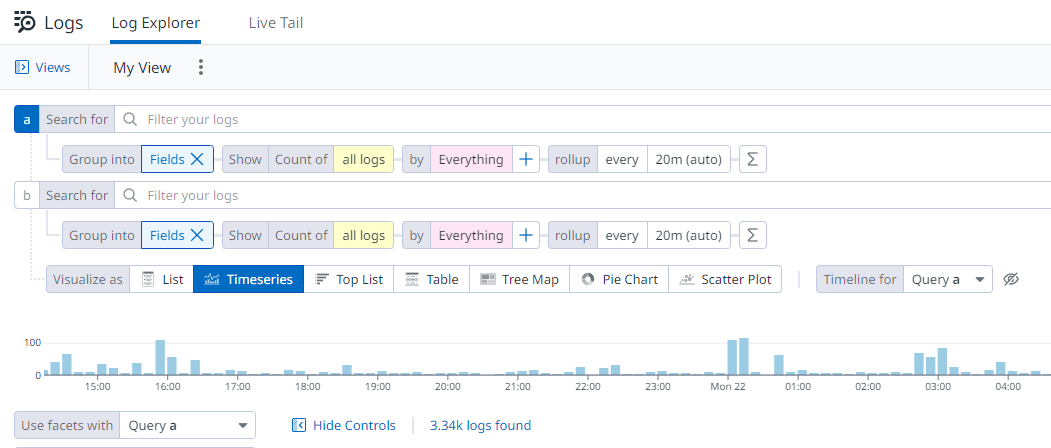
The essence of this screen is not that it is spectacular, but it is an outstanding example of good UX practice. It is hierarchically structured and task-oriented and provides a wide array of functions without overwhelming the user. This is achieved by expert use of colours and contrast and detailed planning in layout and ordering of the controls on the screen. Sometimes the art of UI lies in making the artistry invisible.
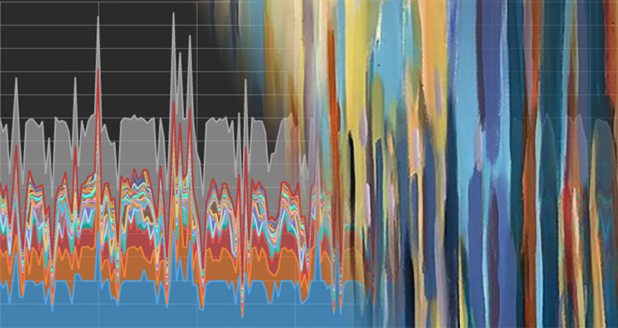
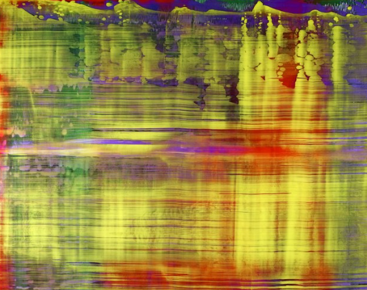
As we have seen in the images returned by the Hubble telescope, nature has a way of arranging itself in incredibly beautiful and elaborate patterns. Not everything in nature is a bell curve - spikes, surges, spirals and explosions abound. ADSB Exposed is a web site that allows users to create stunning interactive maps from real-time flight data. As the image below shows, distributions of data from our own human activity can create spectacular patterns reminiscent of that amazing Hubble imagery.
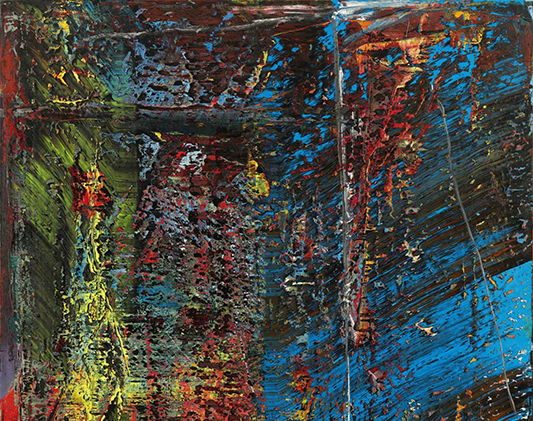
The image below evokes the incredible energy and vibrancy of an abstract expressionist work but is, in fact, a representation of flight data taken from an amazing gallery of visualizations featured on the ClickHouse web site:
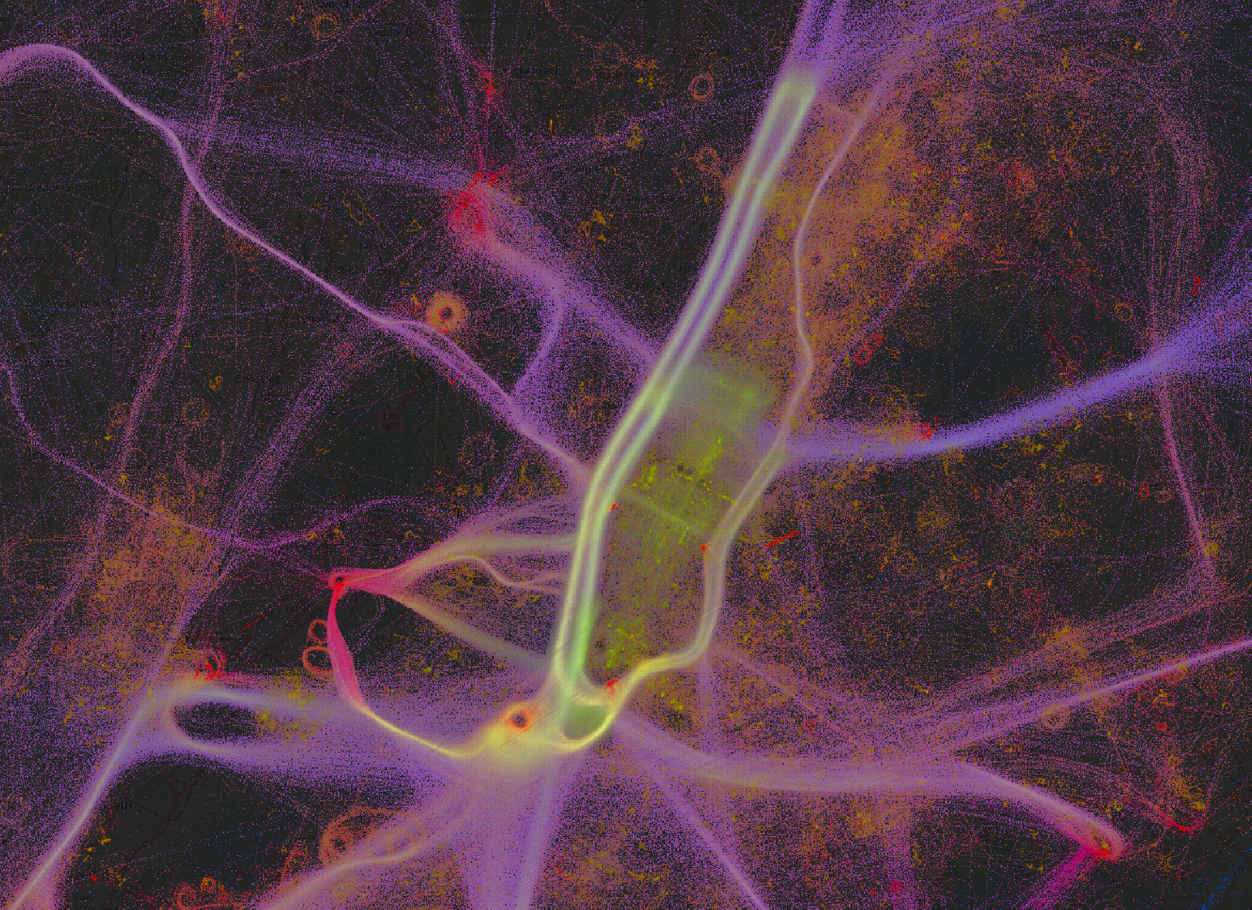
It is easy to see similarities in the above image with the abstract beauty of works by artists such as Gerhard Richter and Danny Giesbers.
The observability marketplace today is extremely competitive. Many vendors compete on criteria such as price or ability to ingest vast volumes of data. Ultimately, observability is about making sense of how our systems are running. Being able to ingest data inexpensively is great - but it has little value for businesses if the system cannot harness that data for actionable insights and intuitive workflows. Ingesting petabytes of data does not help if we cannot easily sift through that data and identify issues quickly and easily. The tooling that enables this ease of use is brought to us by skilled professionals deeply immersed in principles of design and communication but also capable of understanding the fundamentals of observability technology and the needs of end users.
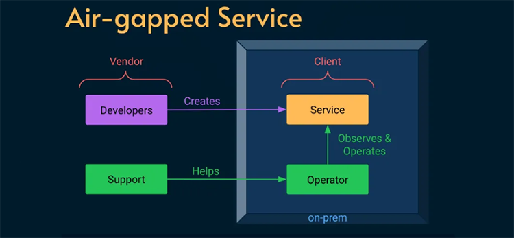
The excellent Alex Ewerlöf blog is now back in full swing and in this latest article he turns his attention to dealing with a real SRE curveball - how to build reliability engineering for an air-gapped system. We are talking hermetically sealed - not even a maintenance window for external connectivity. This task involved a high-security military facility where installing updates meant physically handing over an archive file to a system operator.
The constraints were pretty stringent - no logs, no metrics, no traces, no remote access of any kind.This was an extreme case and, ultimately, the solutions had to be both human-centred as well as relatively low-tech. How would you address the challenge? Hit the link below to read about the solution that Alex put in place.

In the past month or so the GitHub platform suffered a number of well-documented outages which resulted in loss of service for users. In the spirit of transparency, GitHub CTO Vlad Fedorov published this article on the GitHub blog, explaining the causes of the outages and the lessons learned as well as detailing the remediations that GitHub engineers will be putting in place.
The article really brings home the challenges of orchestrating the components of a global technology infrastructure - as well as the compounding effects of working at very large scale. The investigation revealed a perfect storm of edge cases, hidden tipping points and unforeseen knock-on effects. It’s impossible not to feel for the engineers sweating in the war-rooms as the dramas unfolded - after all, watching your failover fail must be pretty gut-wrenching.
If the Observability world had a code of secrecy akin to that of the Magic Circle, then Charity Majors might be in danger of being banished to exile and ignominy. In a single slide deck, she has blown the gaff on a whole trove of insider knowledge. It is the “What they don’t teach you at Harvard Business School” of observability knowledge. Not the abstract theory or technical detail but lessons and insights from the o11y frontline.
The deck in question was used in a talk at the LeadDev event in Berlin earlier this month and its 52 slides are an illuminating distillation of observability wisdom. We actually weren’t present at the talk and only came across the deck thanks to a mention in Michael Hausenblas’s excellent olly news newsletter. However, the slides contain sufficient clues (and images of unicorns) to easily re-construct the narrative and win friends and influence people as an observability savant.

If you are an SRE, when an outage happens you will know about it pretty quick. With security breaches the picture is rather less clear as, by their nature, they are designed to go undetected. Intrusion detection therefore is often based on a mixture of tools designed to spot unusual spikes, suspicious patterns or failed logon attempts.
This article by Fatih Koç argues that one of the major difficulties involved in identifying attacks is that of correlating signals across multiple sources such as Falco, Prometheus, Kubernetes Audit Logs etc. In this article, he outlines a strategy for extracting relevant data from each of these sources and pulling it together into a single observability dashboard.

The first line of cyber defence is normally at the perimeter - preventing attackers from entering your network in the first place. The next line of defence is intrusion detection. This can often take the form of anomaly detection using a variety of heuristics.
There are also some more creative possibilities, such as the canary solution adopted by Grafana. Just as the canary in the coalmine sings to alert underground workers to the presence of toxic gases, Grafana’s canary was designed to alert them to the possible presence of intruders in their domain.

Load testing can be simple in theory but in modern distributed architectures, it involves a lot more than throwing requests at an individual service. This article on the Airbnb engineering blog looks at how the company’s engineers use the Impulse load-testing framework to handle a number of more complex requirements such as dependency mockingand managing messaging and asyncronous calls.
Unfortunately, at the moment Impulse is just an internal Airbnb framework, so you won’t be able to get your hands on it at present. At the same time, the article provides a valuable blueprint for tackling advanced, real world load testing scenarios.
It's an announcement that might have seemed unthinkable not long ago, but the porting of the revolutionary eBPF technology to Windows is now a reality. The ability to bring safe programmability to the kernel has resulted in enormous gains in fields such as security, networking and observability for Linux hosts, so applying the same principle to the Windows ecosystem is obviously an attractive proposition. It is not, though, without its own difficulties. There were a lot of hurdles to overcome and, inevitably, given the differences in OS architecture, this is not a full-fidelity replica of the Linux implementation.
This possibly foundational article by Pavel Yosifovich guides you through the steps involved in boldly going where few have gone before and creating your first eBPF program for Windows. One paragraph in the article begins with the sentence “this is where things get a bit hairy“ - for some that will likely be a challenge rather than a deterrent. This may not be cooking up nuclear fusion in your bedroom, but it does feel pretty radical.

As well as rolling out their Open AI observability solution, Elastic have also been very active within the OpenTelemetry project. C++ has a reputation for being something of a fearsome foe for observability practitioners. In this article on the Elastic blog, Haidar Braimaanie dons his protective gear and attempts to tame the beast with a soothing dose of OpenTelemetry instrumentation.
Unlike languages built in frameworks such as .NET, C++ does not have a standardized runtime environment that supports dynamic instrumentation across all platforms and compilers. C++ also uses a variety of build systems such as Makefiles and CMake, so that implementing instrumentation can be difficult and error-prone. In the article, Haidar looks at adding OpenTelemetry support to a C++ application running on Ubuntu 22.04. He also includes sample code for instrumenting the project with database spans and then observing the application in APM.
After reading this article you may want to give the C++ developer in your life a hug.
Even if you are not familiar with the name of Brendan Gregg, you are almost certainly familiar with the fruits of his labours. Brendan is the creator of the Flame Graph - one of the most important and iconic visualisations in the observability toolkit.
We featured the Flame Graph in our recent tribute to the work of UX designers in the observability arena - but you should also visit Brendans’ web site.
Brendan's latest innovation is the AI Flame Chart. This is an evolution of the original flame graph and its ambitious aim is to help reduce the vast financial and environmental costs entailed in the use of LLM’s. This means that whereas the original flame graph was focused on CPU cycles, the latest generation sets its sights on reducing GPU load. The article discusses the considerable complexities involved in mapping GPU programs back to their corresponding CPU stacks.
The names of some of the instruction sets look intimidating to the uninitiated but the basic concept of the graph is quite simple - the wider the bar, the more resource it consumes.
If you have ever had to grapple with a 3,000 line Helm chart to deploy your observability infrastructure, you may be forgiven for thinking that there must be a better way to do this. Whilst YAML has a certain formal elegance, its syntax struggles to express the architectures and relationships embedded in highly complex systems.
Whilst Pulumi have tackled this problem by enabling the use of high level programming languages for IaC, System Initiative are taking a fundamentally more radical approach. Their goal is nothing other than completely reinventing IaC from the ground up. The blog article for the launch of the product is an incredibly ambitious statement of intent. The terms ‘game changer’ and ‘paradigm shift’ tend to be thrown around somewhat casually, this might be a case where their usage is appropriate.
So, what are they proposing? Well, System Initiative is IaC without the code. It is a kind of digital canvas where you manipulate digital twins of your systems. Is the future here or is this the Platform Engineering equivalent of science fiction? Read the article and decide for yourself!